Cannabis Dispensary Retail | Venus & Mars Apothecary
V&M | Venus and Mars Cannabis Apothecary
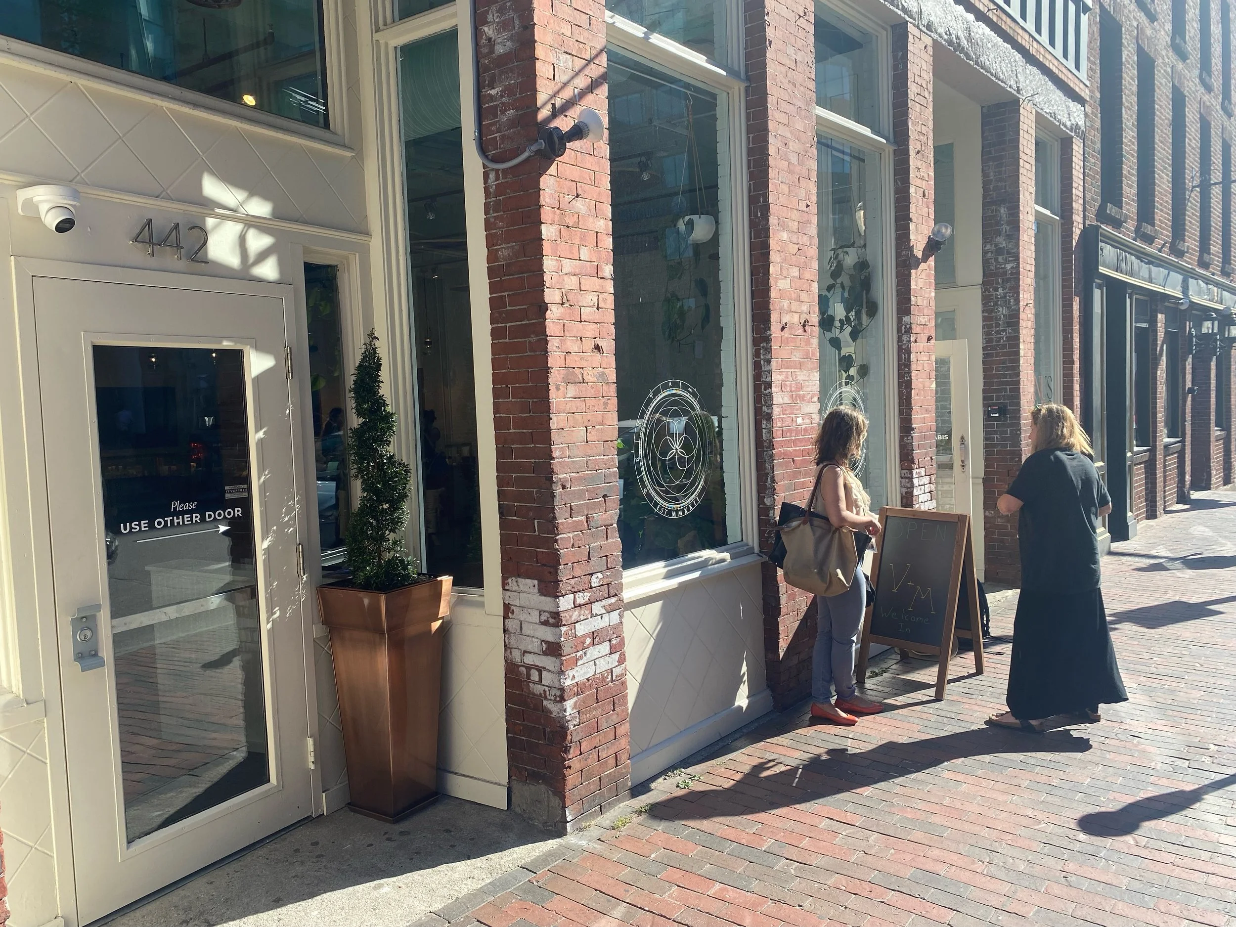
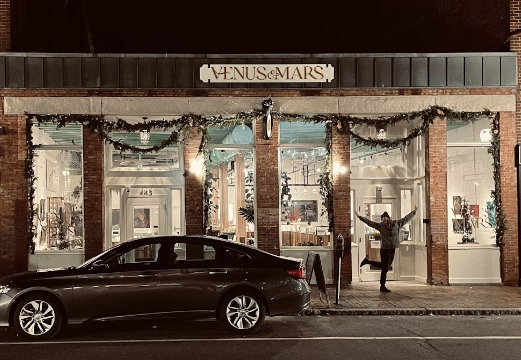
Planting the seeds of the future, with goddess relics of the past the Venus&Mars is a boutique atelier and dispensary – putting a brick in the wall that breaks the current paradigm of pot shop. The Venus&Mars wordmark uses a classic Roman style typeface with a twist that instantly balances feminine and masculine. The use of ampersand was carefully chosen for its connection to the past. The mark features a shorthand V&M monogram alternate logo. The mark echoes the planetary orbits as seen from earth for centuries.


Planting the seeds of the future, with goddess relics of the past the Venus&Mars is a boutique atelier – putting a brick in the wall that breaks the current paradigm of pot shop. The Venus&Mars wordmark uses a classic Roman style typeface with a twist that instantly balances feminine and masculine. The style of ampersand* was carefully chosen for its connection to the past. The mark features a simplified V&M monogram. The loop echoes the planetary orbits as seen from earth for centuries and purposefully dips below the serif base, eluding to a seed being planted beneath the surface.

The ampersand was first created in the first century BC by the Roman slave Marcus Tullius Tiro, who was Cicero’s personal secretary. Even after he was made a free man, Tiro continued to transcribe Cicero’s texts, and by 63 BC he had developed a system of shorthand to speed up the writing process, known as the Tironian Notes. In Old Roman Cursive the ampersand was the ligature between the letters “e” and “t” (“et” means “and” in Latin).
The fonts are a time tested classic combination of Roman style serifs and geometric sans serifs, built for balanced form and function. Garamond has a long history spanning many centuries. Orpheus features a beautiful, owing italic design that takes on a calligraphic feel. Gotham is a geometric sans-serif inspired by mid-century architectural lettering. A splash font such as a specialty script or modern display can bring unique flavor to the brand when used minimally for maximum impact, highlighting subtle details with unexpected ligatures – examples to come.
The palette is nature inspired, and full of texture, opacity and depth, rather than color, an expansion of the materials and colors being developed with the interior atelier space. It speaks to mythology, architecture and universal understanding.
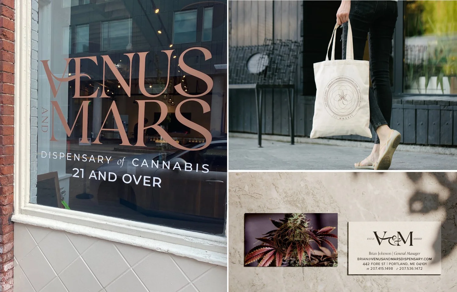
The harmony of the universe is harnessed in the V&M brand. Using inspiration from the earliest mapping of the orbit of planets as seen from here on earth in the 1500’s and 1700’s drawing geometric patterns that are other worldly. Much like Venus&Mars in mythology, the planets have been dance partners for millenia.
OPEN MINDED + TIMELESS + INTUITIVE + NICHE + FREE + ORGANIC + SCIENTIFIC