Barber Shop Brand + Retail Storefront | Woodward Barbers
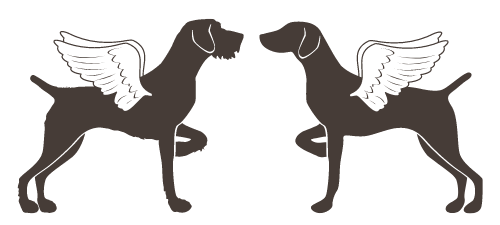
Woodward Barbers is a classic community barber shop in Erie, Colorado. The owners came to BirdDog Partners with a name that has a historical significance, rooted in the iconic Woodward Ave, Detroit. The design suite included straight razor monogram logo, classic typography with a twist, a custom poker deck, iconic storefront signage and more. Guests will come to enjoy first-class, professional grooming excellence amidst classics such as subway tile, houndstooth pattern, signature barber chairs - as well as a few modern surprises - a vinyl listening station, bronze anthropomorphs, a local artists’ mural.
Bespoke Surface Pattern Design | Bright Design & Co.
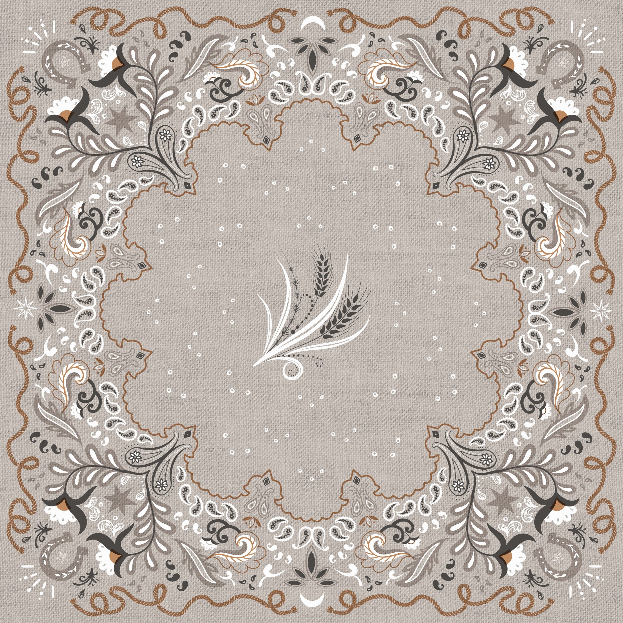
The eco-friendly paper good tabletop design solution that adds a pop of color and pattern to every setting and space in your home.
Cannabis Dispensary Retail | Venus & Mars Apothecary
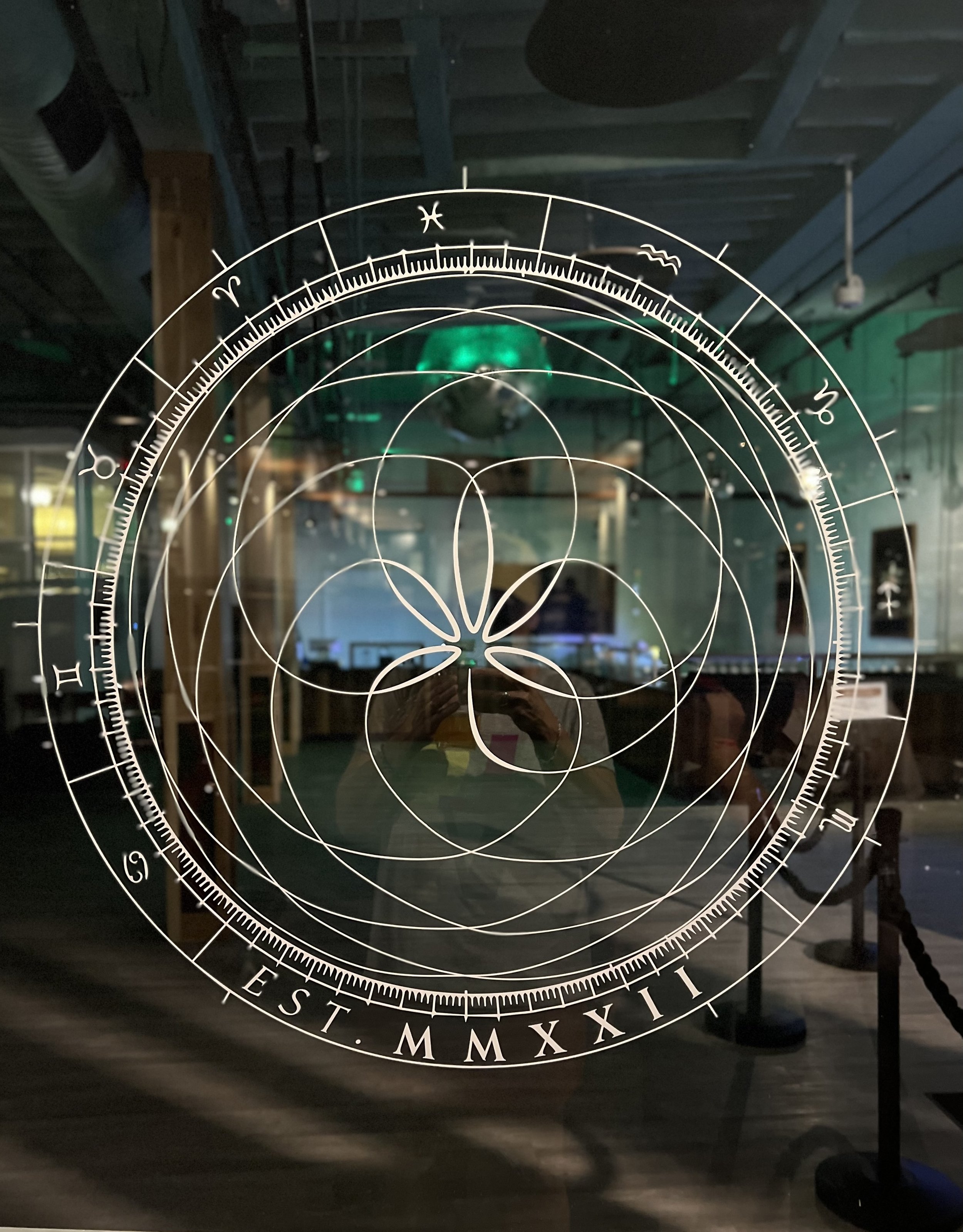
Planting the seeds of the future, with goddess relics of the past the Venus&Mars is a boutique atelier – putting a brick in the wall that breaks the current paradigm of pot shop. The Venus&Mars wordmark uses a classic Roman style typeface with a twist that instantly balances feminine and masculine. The use of ampersand was carefully chosen for its connection to the past. The mark features a shorthand V&M monogram alternate logo. The mark echoes the planetary orbits as seen from earth for centuries.
Bespoke Interior Design Studio Branding | Aspen Design House
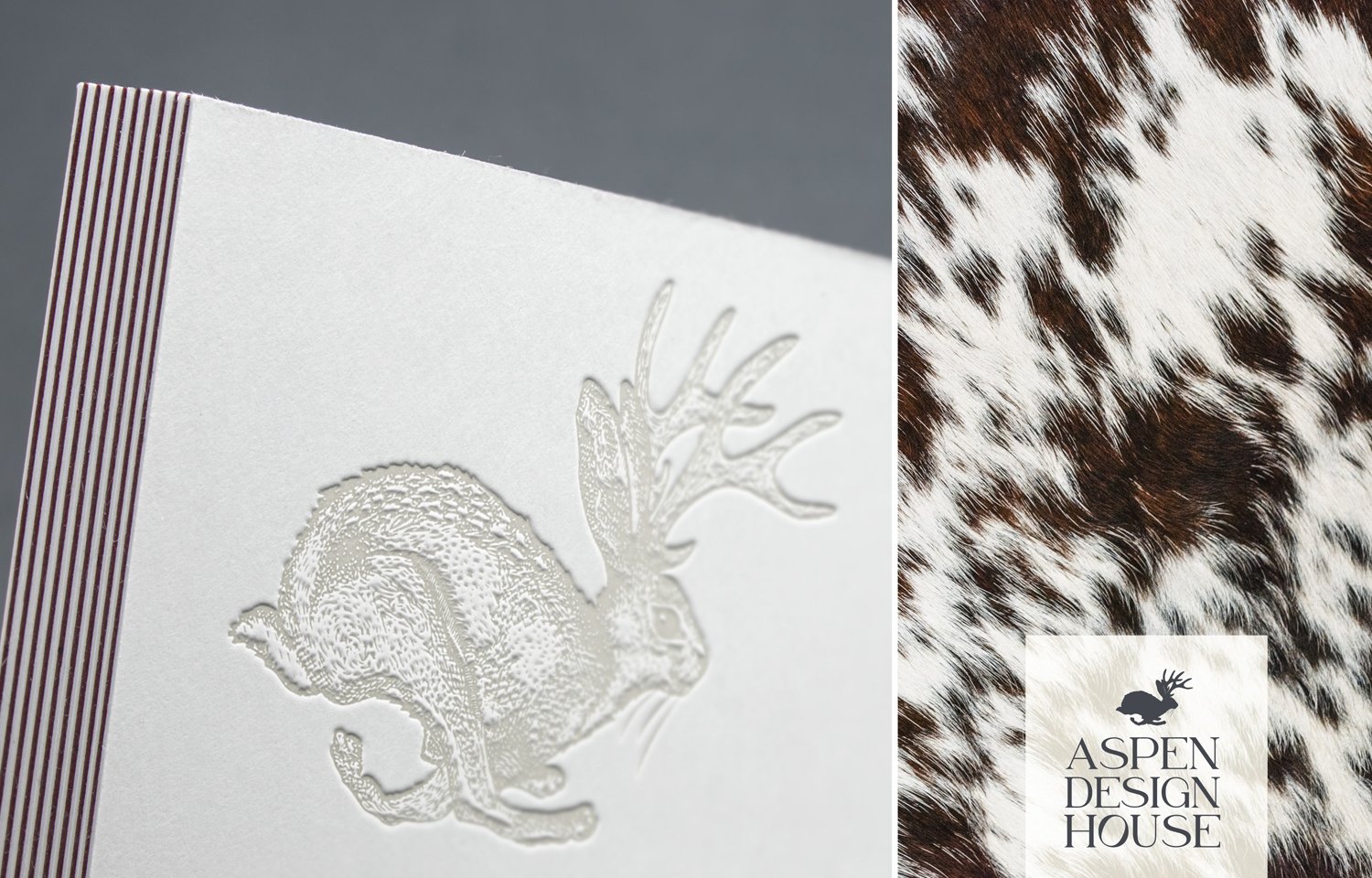
Much like putting together the elements of a home, the logo and marks are a collective o f layered texture, shape, scale and colorful detail that celebrate the fact that every client is a snowflake. Telling a story in any combination, there is a balance of both intellectual and charming bits that await you around every corner.

Health & Wellness Brand | Aspen Valley Nutrition
Rooted in whole body wellness, Kristy Vetter guides her clients to proper nutrition through health education. Always: Individualized, Long-Term and Evidence-Based. Never: Fad Diets, Mass-Market or Standardized. The logo is an amalgamation of concepts including nutrition and health, as well as symbols of nature, aspen leaves, sunshine and mountain peaks in a sophisticated, simplified emblem that will translate well across the brand.

Plant Shop Retail Branding | Sage + Grace Botanicals
Our homes are to be our sanctuaries. A place where we feel most connected to ourselves, relaxed and centered. We are meant to live close to nature and that is exactly why plants lift our mood and create serine environments in our homes or office. It’s self-care in the simplest and purest form.
Private Chef and Catering Brand | eat aspen
Eat is a creative culinary company located in Aspen, Colorado that takes great pride in creating dishes that are real, rustic and harvested fresh. Chef Katie believes that healthy cuisine can be joyful, creative - and, of course, beautiful and delicious!

Custom Letterpress Wedding Invitation | Paper Airplane
A custom letterpress wedding invitation created to tell the story of how the couple met during a layover in an airport. A graphic representation of air travel and a love story, pressed into paper.

Letterpress Wine Label Design
In the original BirdDog Press prime letterpress era, a couple of wedding clients, hand-crafted their very own wine to share with their guests and mark the occasion of their union. We letterpressed a custom label that included an inspiring French proverb.
