Bespoke Interior Design Studio Branding | Aspen Design House
Aspen Design House | Bespoke Interiors
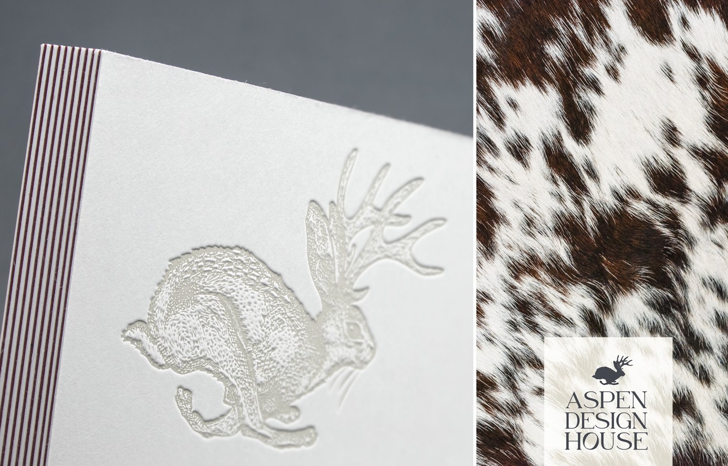
Much like putting together the elements of a home, the logo and marks are a collective of layered texture, shape, scale and colorful detail that celebrate the fact that every client is a snowflake. Telling a story in any combination, there is a balance of both intellectual and charming bits that await you around every corner. The lettering is a nod to timeless wine labels that are richly rooted in history and cultivation, with a few surprising modern curves balanced by modern architectural serifs.
The fonts were carefully chosen for their range of weights and styles that work together seamlessly. The wordmark has classic serif letterforms with a modern twist, speaking the the bespoke offering. A hybrid scotch-style modern serif, known for its warmth and adaptability, was chosen for the main header style. Paired with an honest, familiar sans serif, celebrating the letterforms of everyday life and used largely in digital applications. A penciled in splash font and some crafted numbering used very sparingly will bring an extra personal touch. The palette is inspired by a signature style of natural elements and fibers and rich neutrals that celebrate a life well lived and an appreciation for fine things.
ARTISTIC + CULTIVATED + INTERNATIONAL + CHARMING + INNOVATIVE + TIMELESS + LUXURIOUS


