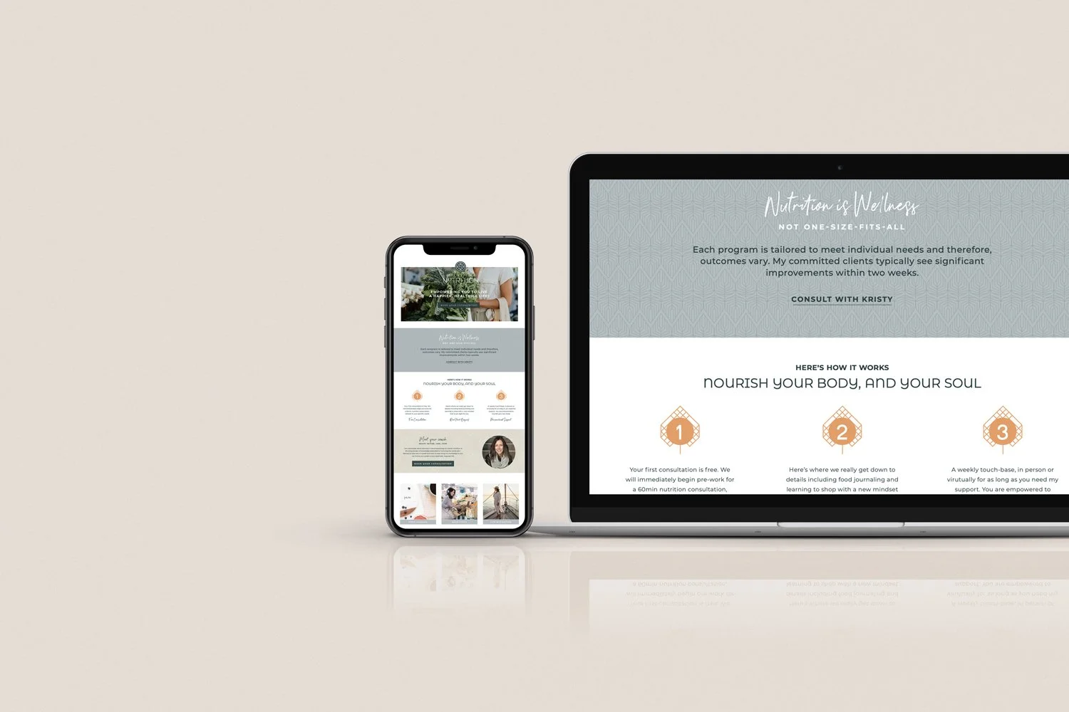
Health & Wellness Brand | Aspen Valley Nutrition
Aspen Valley Nutrition | happier, healthier, life!
Rooted in whole body wellness, Kristy Vetter guides her clients to proper nutrition through health education. Always: Individualized, Long-Term and Evidence-Based. Never: Fad Diets, Mass-Market or Standardized. The logo is an amalgamation of concepts including nutrition and health, as well as symbols of nature, aspen leaves, sunshine and mountain peaks in a sophisticated, simplified emblem that will translate well across the brand. The typography echoes the geometric shapes of the mark while honoring the professional service that connects people to the value of their whole wellness.
Font choices are easy to digest and educational and encouraging. A couple of splash fonts mixed in will offer warmth and personality that reflects the level of service and one-to-one experience. The palette is inspired by a simple balanced breakfast on the table, they are muted while still feeling delicious. Patterns will add delight in place of photography, carrying through the theme of simple thin lines.
OUTGOING + SOPHISTICATED + LUXURIOUS + MOTIVATING + EDUCATIONAL + ACCOUNTABLE


